Overview
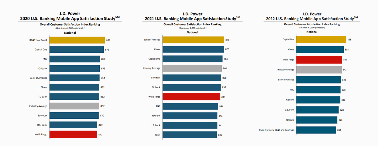
Between 2022 and 2023, I joined the design team rebuilding the end-to-end digital experience for Wells Fargo — web and mobile. The bank was trusted, but the product was not. Customer feedback was loud and consistent: the digital experience was holding the relationship back.
Our mission aligned with Wells Fargo’s multiyear strategy to become digital-first and reinvent personal finance through enhanced digital capabilities and strategic tech partnerships.
My Role
As a Senior UX Designer, I:
- Led UX research to identify pain points across web and mobile.
- Designed intuitive flows for the highest-traffic tasks — payments, check deposits, transaction tracking.
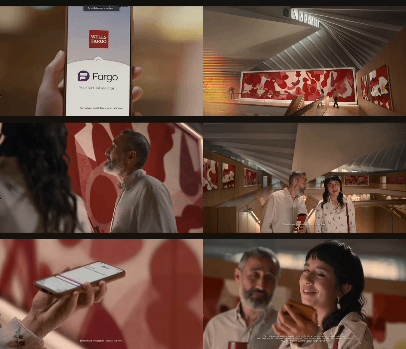
- Partnered with product, engineering, and strategy to integrate new features, including the launch of Fargo™.
- Prototyped and ran usability testing to validate and iterate.
The challenge
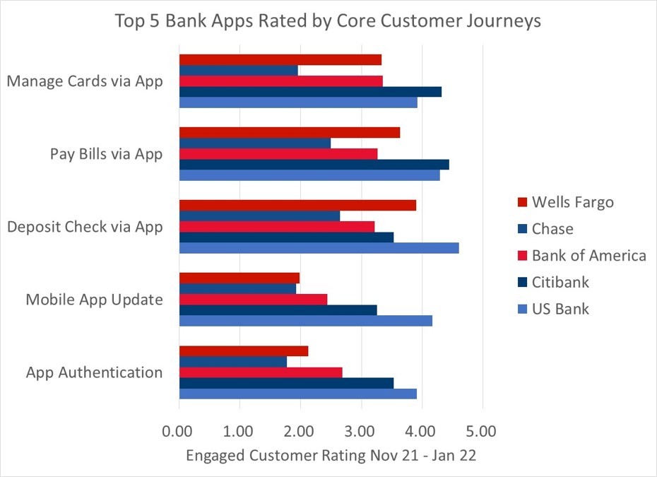
Millions of users had told Wells Fargo what was broken:
- Managing payments was complex — sending money, depositing checks, scheduling bills.
- Tracking transactions lacked the visibility and accuracy users needed to stay on top of their finances.
- Patterns and flows diverged across web and mobile — the experience felt fragmented.
The brief: rebuild the digital banking experience end-to-end, and introduce Fargo™, an all-new virtual assistant, to make it feel intuitive, seamless, and personal.
"For many of our customers, Wells Fargo is the full digital experience — web and mobile applications. The majority of their day-to-day personal finance is done digitally. Our strategic investments reflect Wells Fargo’s deep commitment to providing our customers an experience that reflects their expectations for intuitive, seamless, and personalized digital experiences."
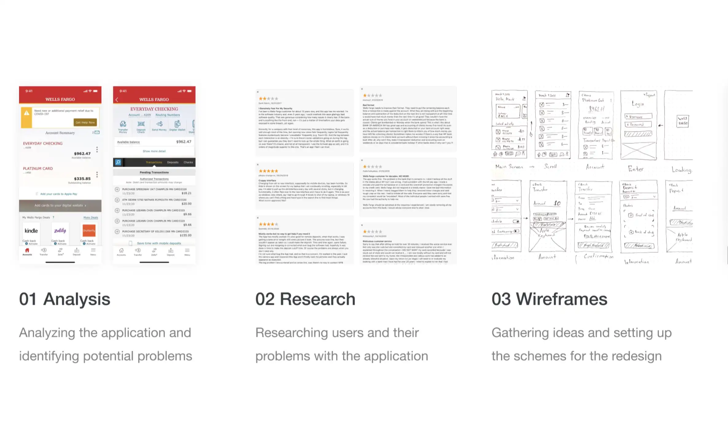
Research& discovery.
We approached discovery from three angles:
User feedback analysis
Collected and synthesized feedback from millions of users — recurring frustrations around payment scheduling, check deposits, and transaction history. Identified the pain points pulling hardest on satisfaction and retention.
Surveys
Quantitative read on preferences, behaviors, and frustrations — and on the features users were asking for loudest.
User interviews
One-on-one conversations to surface the emotional and functional weight behind the data. The pattern was consistent: people wanted financial management to feel simpler, calmer, and more personal.
Approach
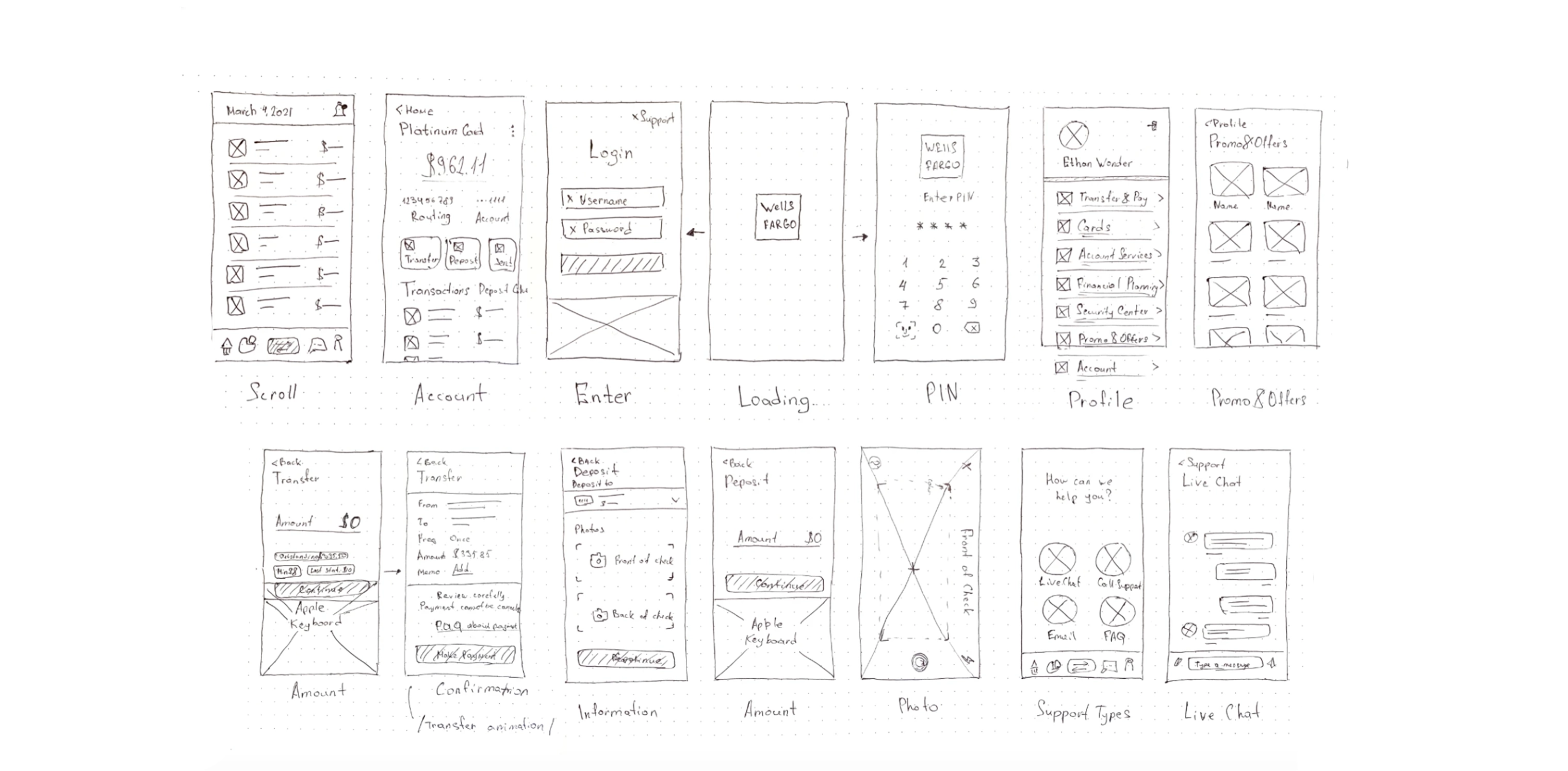
Financial tasks carry real weight. I pushed for a user-centered approach grounded in simplicity and personalization — and worked closely with research to translate insight into design decisions, not just artifacts.
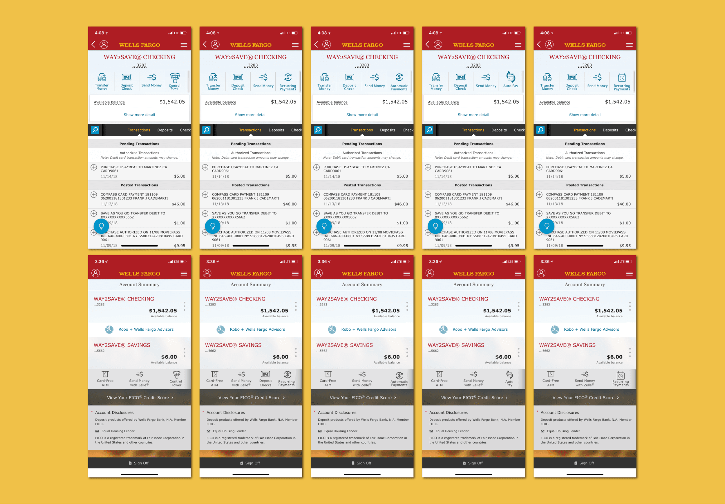
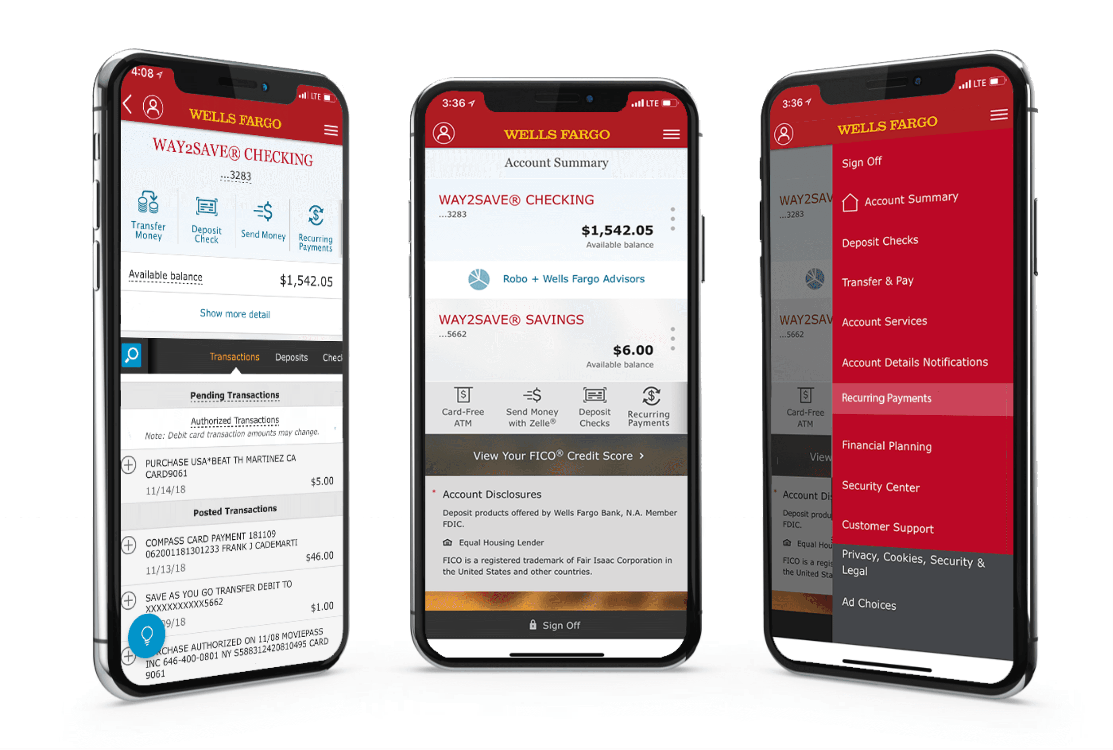
Design& delivery.
Pay & Transfer Hub
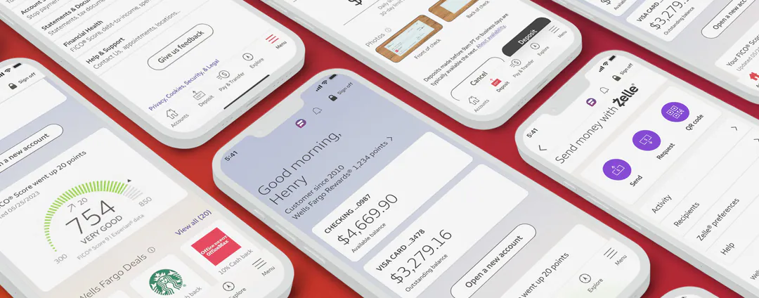
A one-stop surface for payments and transfers — streamlining how money moves in and out. Scheduling and tracking got first-class treatment, giving users visibility and control over what was happening to their money and when.
Fargo™ — the AI assistant
Treated as a relationship, not a chatbot. Fargo™ was designed to:
- Answer everyday banking questions with contextual relevance.
- Complete tasks on behalf of users — reducing manual effort.
- Deliver personalized insights and financial recommendations.
Visual & navigation system
A modern, cohesive visual language across web and mobile. Navigation rebuilt around clarity and accessibility — the same patterns, in the same places, on every surface.
Cross-functional collaboration
Worked shoulder-to-shoulder with product, engineering, and data — aligning user needs with business goals and technical constraints. Ran workshops and sprints to keep delivery tight and iterative.
Outcomes& impact.
The redesign and Fargo™ launch delivered:
- A 14% year-over-year increase in mobile logins — reaching 1.7 billion mobile sessions in Q3 2023.
- A 17% increase in users' logged-in time, reflecting deeper day-to-day engagement.
- Higher engagement and satisfaction, driven by the Pay & Transfer hub and Fargo™.
- Positive sentiment on the new look and feel — users described banking as easier and more enjoyable.
Business impact
The experience anchored Wells Fargo’s digital-first strategy and reinforced its competitive position. Customer retention improved; adoption of digital features grew.
Lessonslearned.
User-centered AI
Designing Fargo™ proved how much context matters in AI interactions. The goal was an assistant that felt intuitive, not intrusive — transparent and trustworthy enough that users would let it do real work.
Cross-disciplinary work
Balancing user needs with business goals and technical reality was the real job. The discipline was advocating for the user without losing the room.
Continuous feedback
A live feedback loop let us adapt fast. For a product this complex, iterative design and testing weren’t optional — they were the operating system.
"Our customers live on their phones, accomplishing every task and planning their next important life moment all via digital. They expect their mobile banking app to mirror the same frictionless and time-saving experiences they get with other apps they use. The rebuilt mobile app will lay the foundation for a digital personal finance experience that pushes the whole industry forward."
Conclusion
The work raised the bar inside Wells Fargo — and helped move the bar for the category. Leading UX on a product at this scale sharpened my conviction in three things: human-centered AI, scalable design systems, and strategic collaboration.

I carry that into every project that comes next.