
Overviewfrom paper & phone calls to self-service.
McLane Company is one of the largest distributors of retail and restaurant products in the United States, supplying tens of thousands of convenience stores, restaurants, and retailers. For most of those store managers, staying on top of their McLane order meant juggling phone calls, faxed invoices, and a patchwork of legacy tools — with little real-time visibility into what was coming, when, and at what cost.
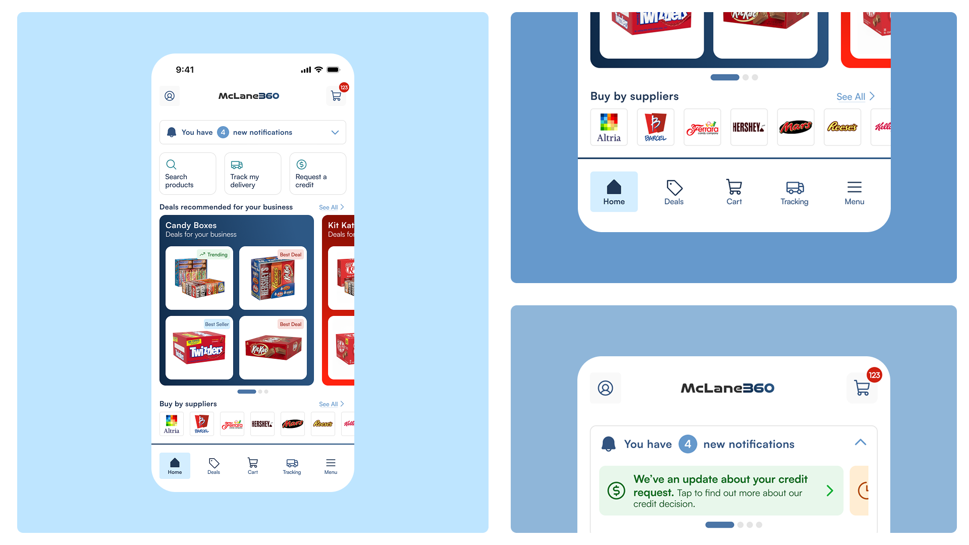
McLane360 is the web and mobile app built to change that: a single, modern, self-service experience where operators can discover the app, register their store, log in securely, and manage the full lifecycle of their deliveries — ordering, tracking, invoices, and support — from their phone.
My role& responsibilities.
As Product Designer, I owned the end-to-end experience from research through final UI and design-system delivery. My responsibilities included:
- Leading UX research with store managers to map their real workflows and surface the friction points that kept them off digital tools.
- Designing the onboarding and authentication journey — discovery on the app stores, registration, easy login, and password recovery — so first-time users could get to value fast.
- Designing the core delivery-management flows — home dashboard, order tracking, invoices, and support — around the tasks managers do most.
- Building and maintaining the AI ready design system to keep web and mobile consistent.
- Partnering cross-functionally with product, engineering, and supply-chain stakeholders to ship within real technical and operational constraints.
The challengean easier way to manage orders.
Retail and restaurant operators run lean. A store manager's day is spent on the floor, not at a desk — yet the tools for managing one of their largest recurring expenses, their McLane orders, demanded exactly that. Research and stakeholder input pointed to a few recurring problems:
- The need for efficiency — managers wanted to handle orders and deliveries in the gaps between serving customers, not by sitting on hold or sorting paperwork.
- No real-time visibility — without reliable tracking, managers couldn't confidently plan staffing, shelf space, or cash flow around an incoming delivery.
- A fragmented, hard-to-discover experience — onboarding, ordering, invoices, request a credit and support lived in disconnected places, and many operators didn't even know a dedicated app existed.
- High-friction account setup — registration and password recovery were painful enough to push users back to the phone.
The goal was to rebuild the experience around the manager's actual day — a mobile-first platform that's easy to find, fast to set up, and genuinely useful in the few minutes they have to spare.
Research& discovery.
To understand the real pain points and expectations, I used a multifaceted research approach:
- Workflow analysis — mapped how managers currently order, track, and reconcile deliveries to find where they dropped out of digital tools and back to the phone.
- Stakeholder & survey input — gathered quantitative signal from supply-chain and operations stakeholders on the most-requested capabilities and highest-volume tasks.
- Manager interviews — one-on-one conversations with store managers surfaced the emotional and practical reality: they want speed, certainty, and zero learning curve.
Personas & feature mapping
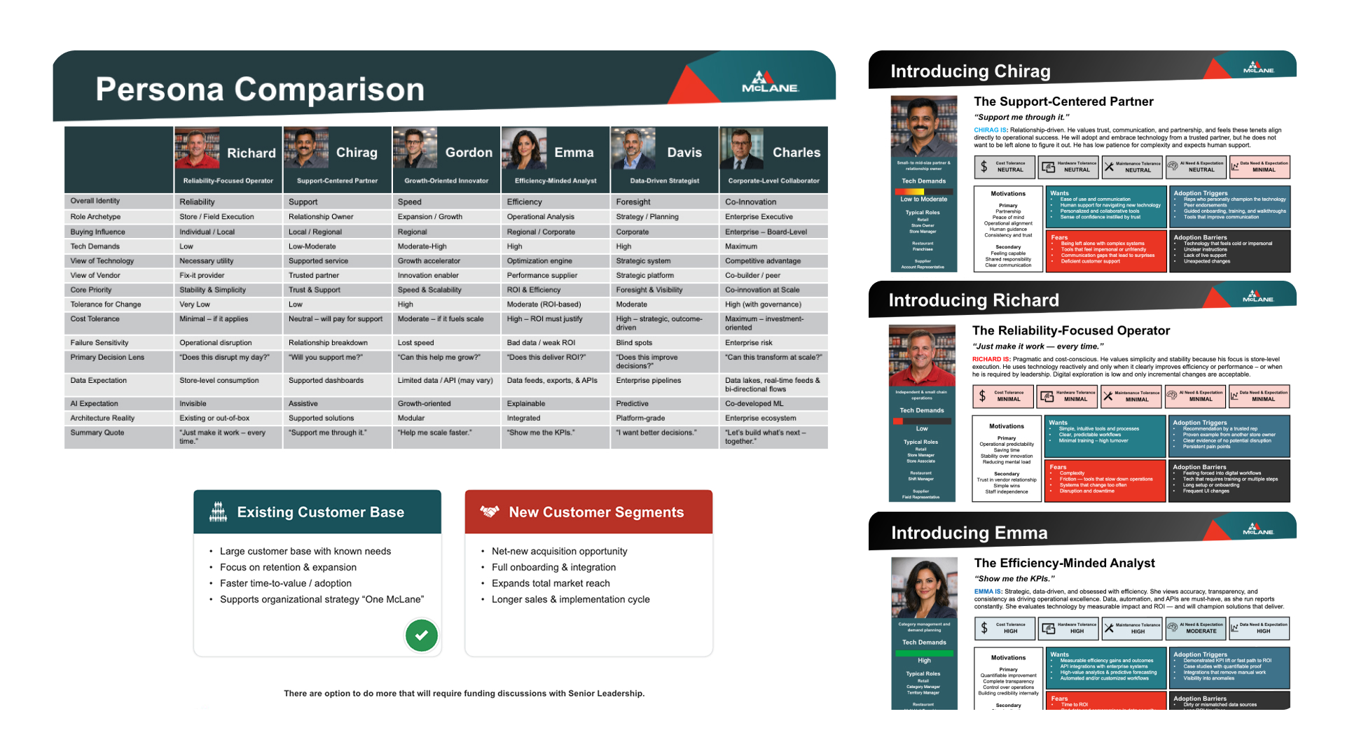
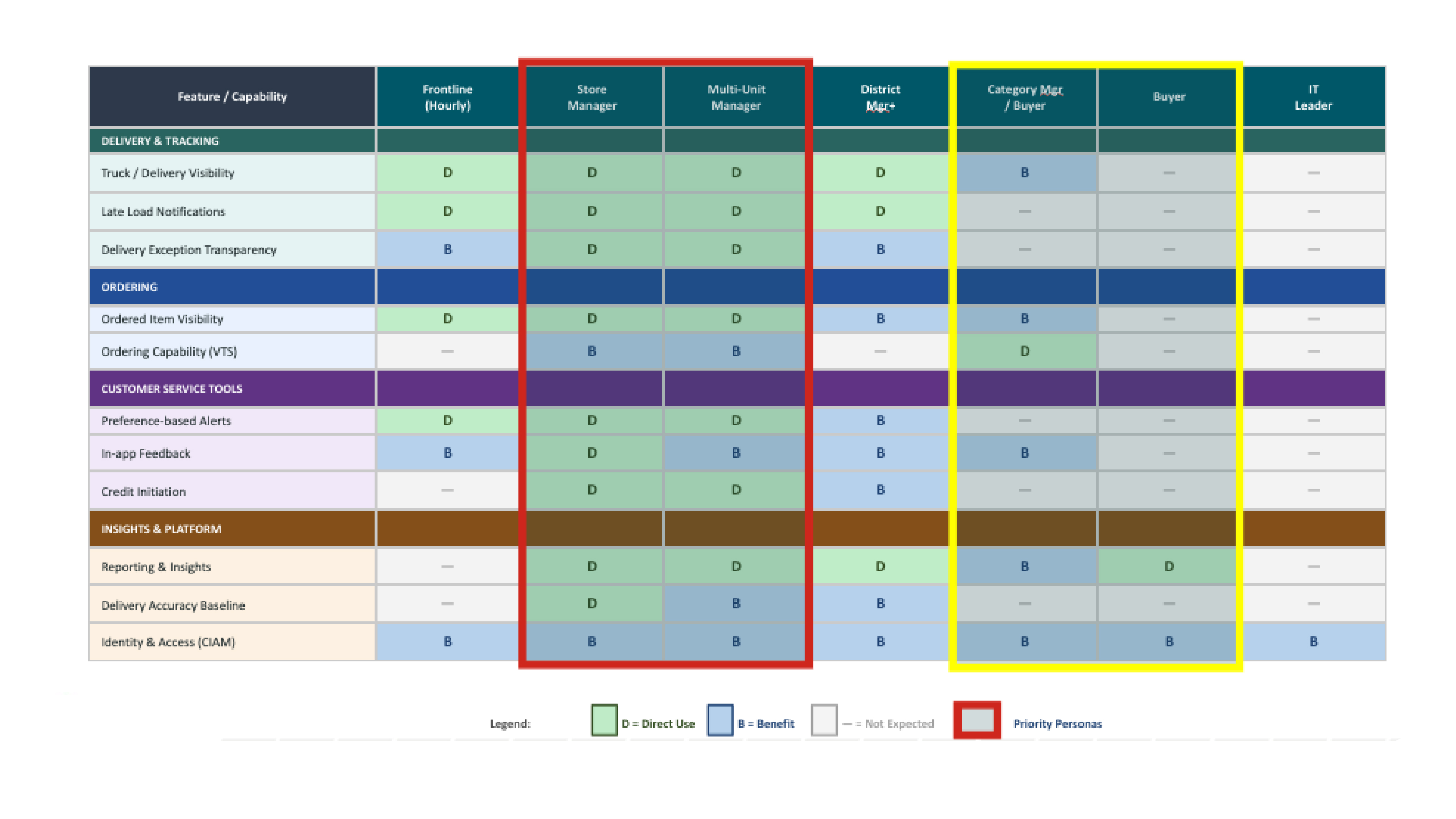
Six distinct personas emerged from the research — from frontline store managers like Richard (reliability-focused, low tech tolerance) and Chirag (support-centered, relationship-driven) to efficiency analysts like Emma who live in dashboards and expect API-level transparency. Each persona carried different motivations, adoption triggers, and fears. We built a feature-capability matrix that mapped every proposed capability to the personas who would use it directly (D) or benefit from it indirectly (B) — so every design decision was traceable back to a real human need and a validated business rule, not an assumption.
AI in research & synthesis
To move from recorded meetings, workshops, and discoveries, I used AI tools like Claude, Notebook LM, to get input, feedback, and insight faster — clustering interview notes and survey responses into affinity maps, then using Claude to pressure-test the themes and draft tight problem statements. AI compressed the messy middle of synthesis so I could spend more time validating the patterns with stakeholders than formatting sticky notes.
Approachthe journey before the screens.
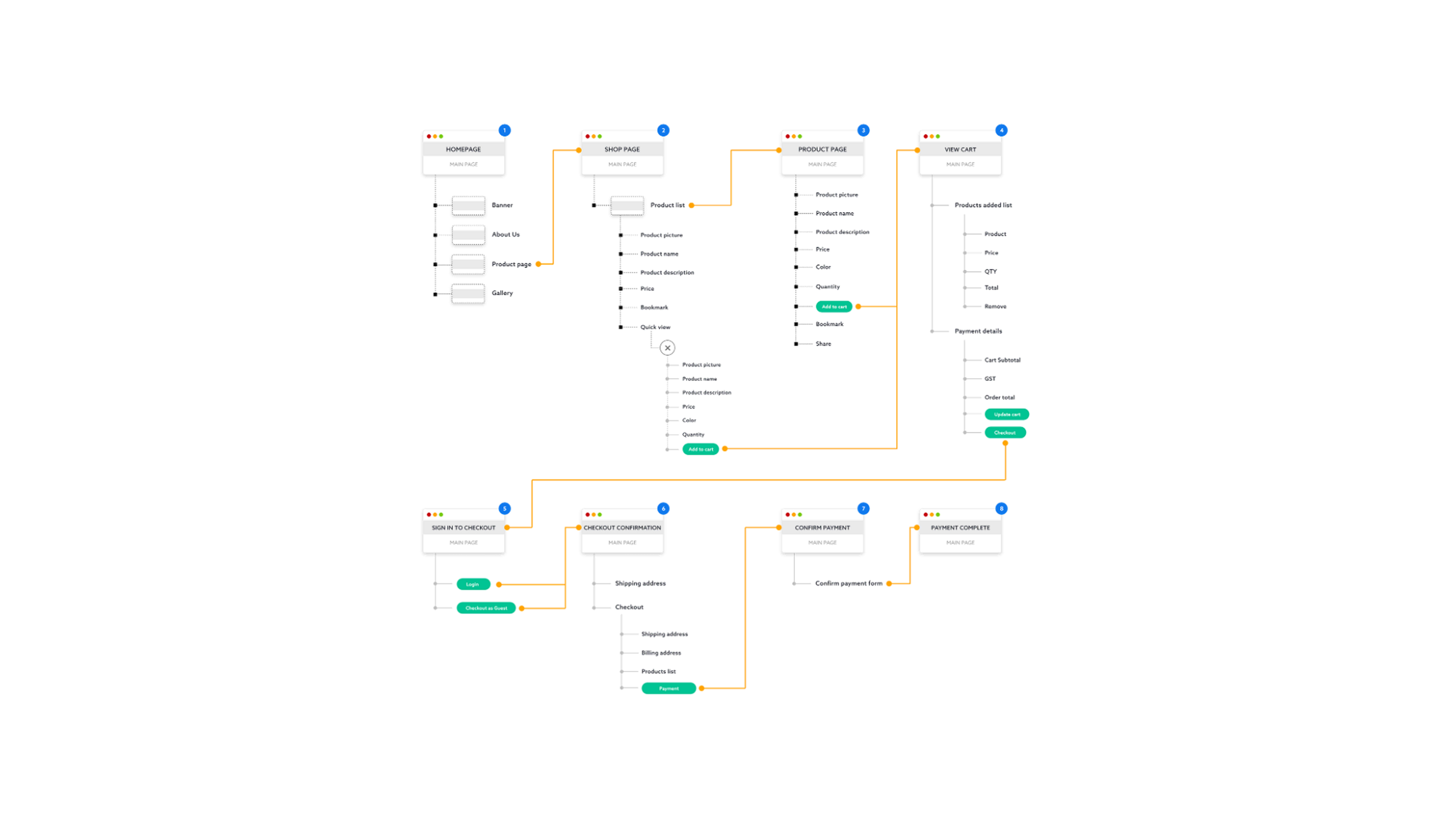
Rather than jumping to UI, I started by mapping the end-to-end onboarding storyboard — the path from a manager first hearing about McLane360 to landing on their personalized home. This kept the team aligned on the experience as a whole and made sure every screen earned its place in the journey. I used Claude as a thinking partner here — stress-testing the flow for edge cases (lapsed accounts, failed logins, multi-store operators) and rapidly exploring divergent paths before committing to one.
Key designsolutions.
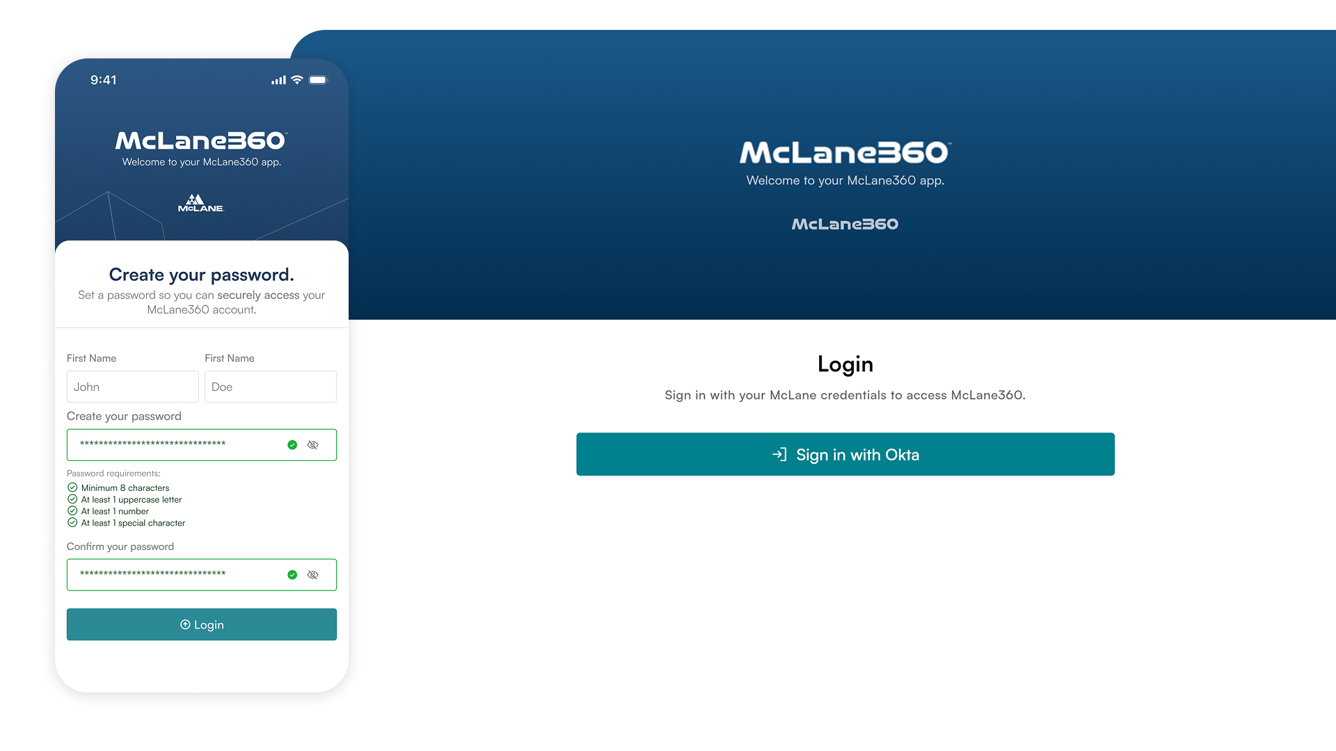
1. A frictionless onboarding & login flow
I designed discovery-to-first-login as one continuous path: clear app-store presence, a fast email-and-password login for returning users, a guided store-registration flow for newcomers, and self-service password recovery — so a manager can be set up and productive without ever calling support.
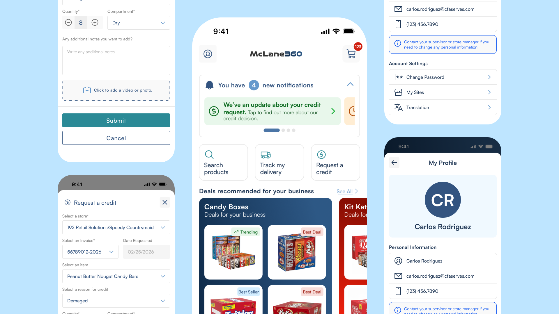
2. A super app concept home dashboard
The home screen leads with what matters most — orders, deals, and deliveries, its time, and one-tap access to the highest-volume tasks: track order, place order, invoices, and support. The dashboard adapts to the manager's store, surfacing their account context the moment they log in.
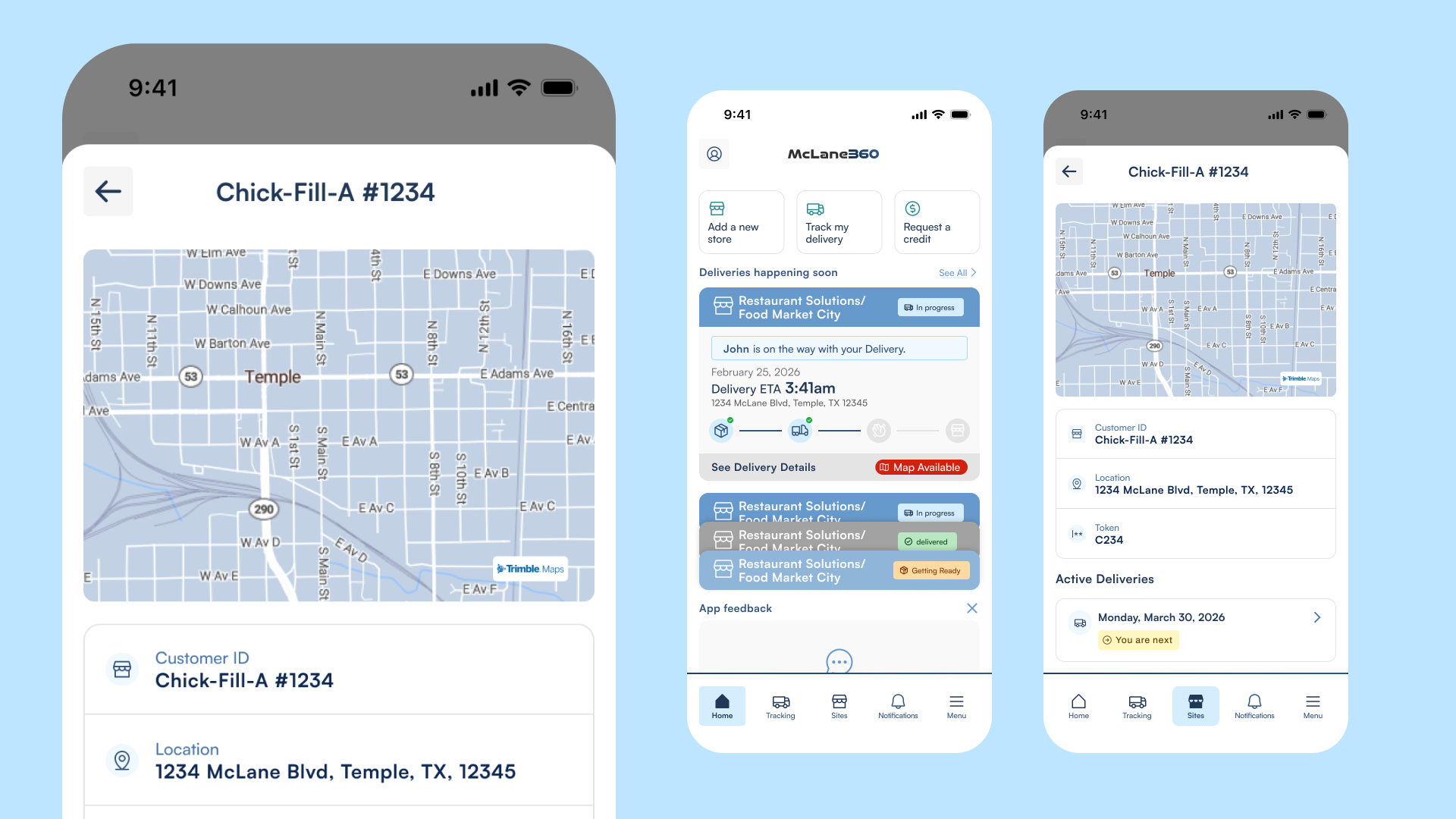
3. Live order tracking
A clear, status-driven tracking view replaces phone calls with confidence: confirmed, picked, out for delivery, delivered — plus access to the manifest — so managers can plan staffing and shelf space around an arrival they can actually see.
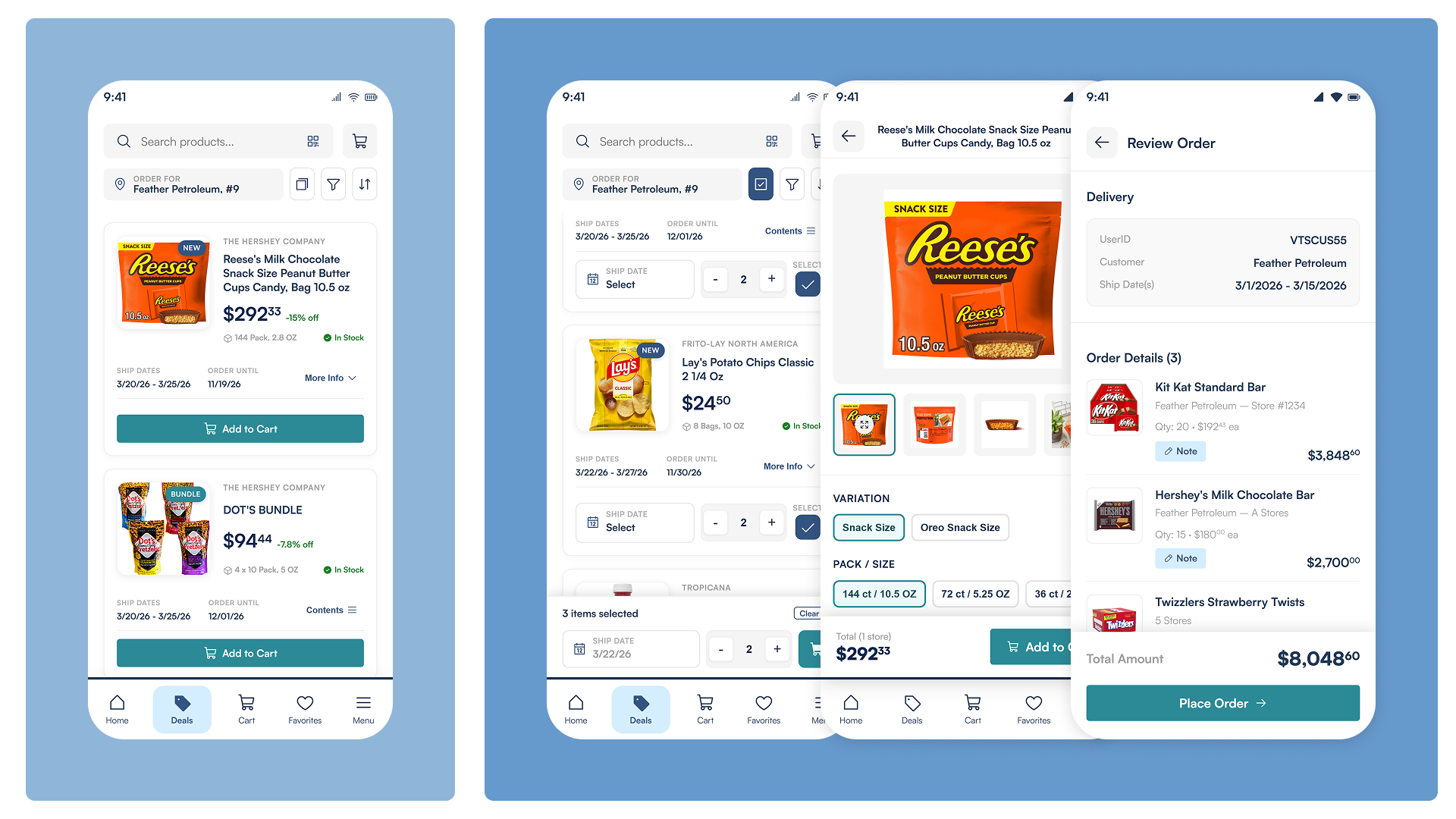
4. Deals and Ordering
Customers can browse for deals, place an order for multiple stores, shipping for multiple dates, and edit any placed order to remove or add new items before it is shipped.
5. A consistent design system
I built McLane360 on a reusable foundation — using McLane Design System, AI-ready and shared components — keeping the experience cohesive across mobile and web, and faster for engineering to build.
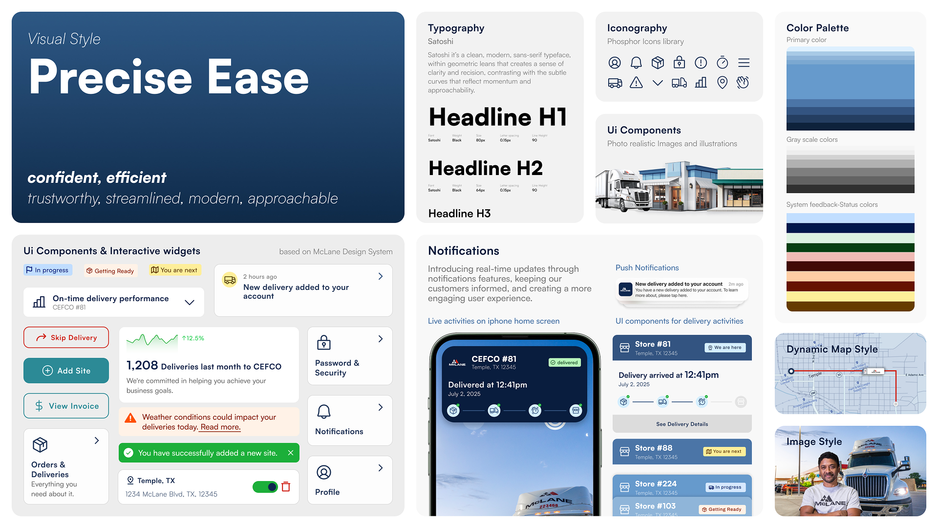
How AI accelerated the design work
AI was part of the production loop, not a novelty. I used Figma AI and Claude Design to spin up first-draft layouts and explore visual directions quickly, then refined them by hand against the design system. For UX writing — onboarding copy, empty states, error and status messages — I drafted with Claude agents and edited for McLane's voice, keeping the language plain and reassuring for managers with no time to decode jargon. The leverage wasn't replacing design judgment; it was removing the blank-page tax so I could iterate on more options in less time.
Collaborationcross-functional.
I worked closely with product managers, engineers, and supply-chain stakeholders to align on business goals and technical constraints, and ran working sessions to keep design and development iterating in sync.
Outcomea platform managers want to open.
The redesigned McLane360 experience reframed delivery management from a chore into a fast, self-service routine. Qualitatively, the work delivered:
- A dramatically simpler onboarding path — from app-store discovery to a productive first session, and place an order with no support call required.
- Real-time delivery visibility that lets managers plan around arrivals instead of reacting to them.
- A cohesive, modern look and feel across mobile and web, backed by a reusable design system.
25% faster first-time onboarding / time-to-first-login · −40% reduction in delivery-status support calls · 18% increase in monthly active store managers.
Lessonswhat this project taught me.
Design the journey, not just the screens
Starting from an end-to-end storyboard kept every stakeholder aligned and made sure each screen served the manager's real path — from discovery to a personalized home.
For busy users, certainty beats features
Store managers didn't want more capability; they wanted to know what was coming and to handle the essentials in seconds. They were looking for an app that was able to place an order, track the delivery, request a credit giving them visibility and speed.
A design system is a force multiplier
Investing early in tokens and reusable components kept mobile and web consistent and made the team measurably faster downstream.
Conclusionan effortless routine.
McLane360 reimagined a fragmented, phone-dependent process as a modern self-service platform built around the realities of running a retail or restaurant business. Leading the UX for it reinforced how much impact comes from a clear journey, a relentless focus on speed and certainty, and a scalable design foundation. I'm excited to carry these lessons into future work — driving innovation and genuinely user-centered design.