The challenge
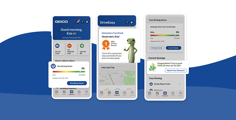
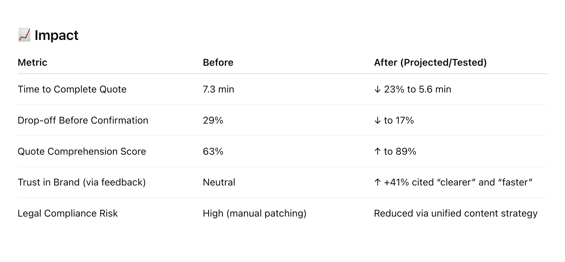
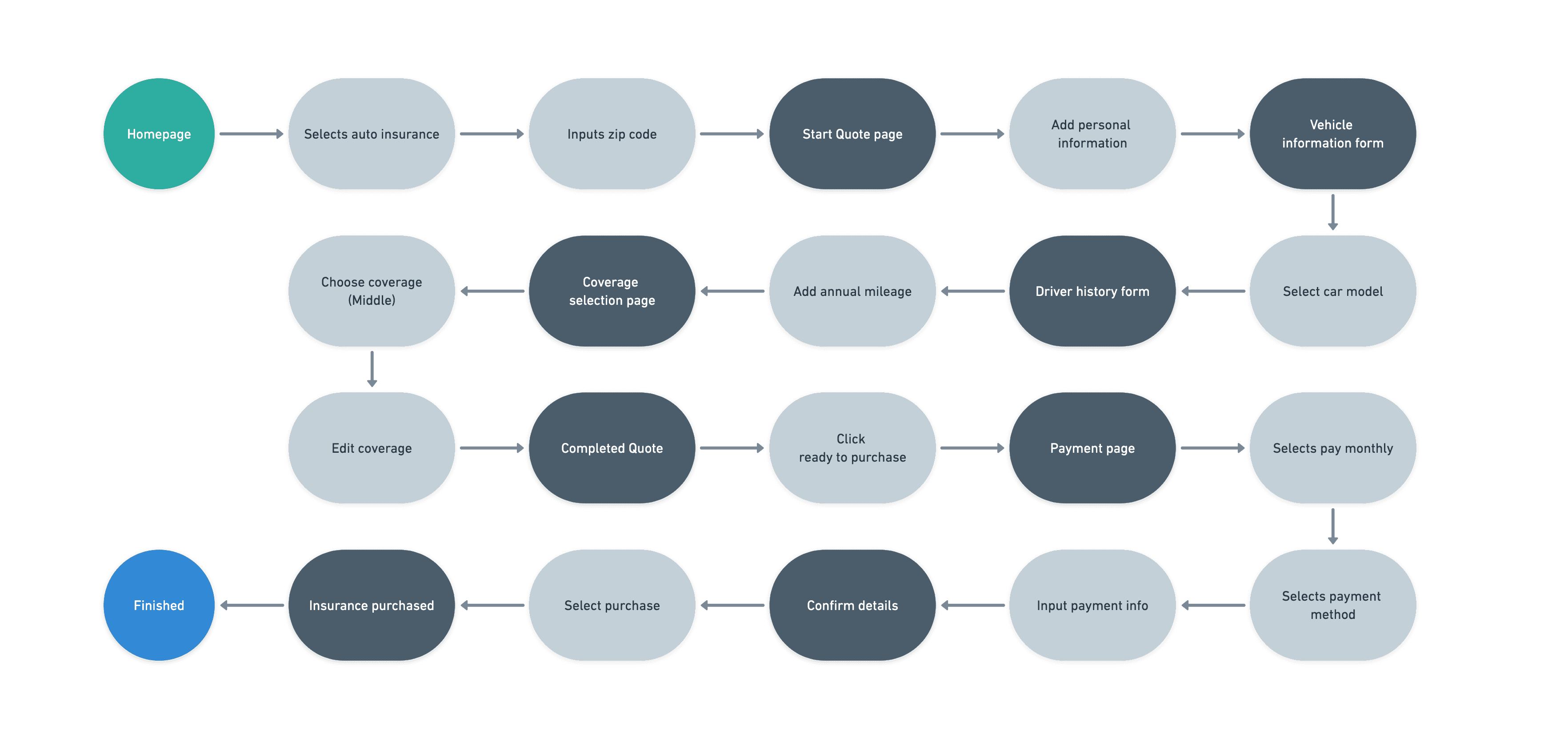
The GEICO sales quote flow had become confusing under layers of past experiments, repetitive questions, and non-transparent content. Customers were dropping off frustrated at critical moments — the point in the journey where intent is highest and friction costs the most.
A recent moderated usability test of the “Happy Path” surfaced a pattern:
- A confusing, multi-step confirmation process.
- Repetitive data collection across screens.
- Lack of content clarity and transparency.
- No clear marketing communication preferences.
- A disjointed experience between screens.
We treated this as more than a UX issue. It was a trust and efficiency problem — and a massive opportunity to reset the standard for how the quote experience behaves.
Goals
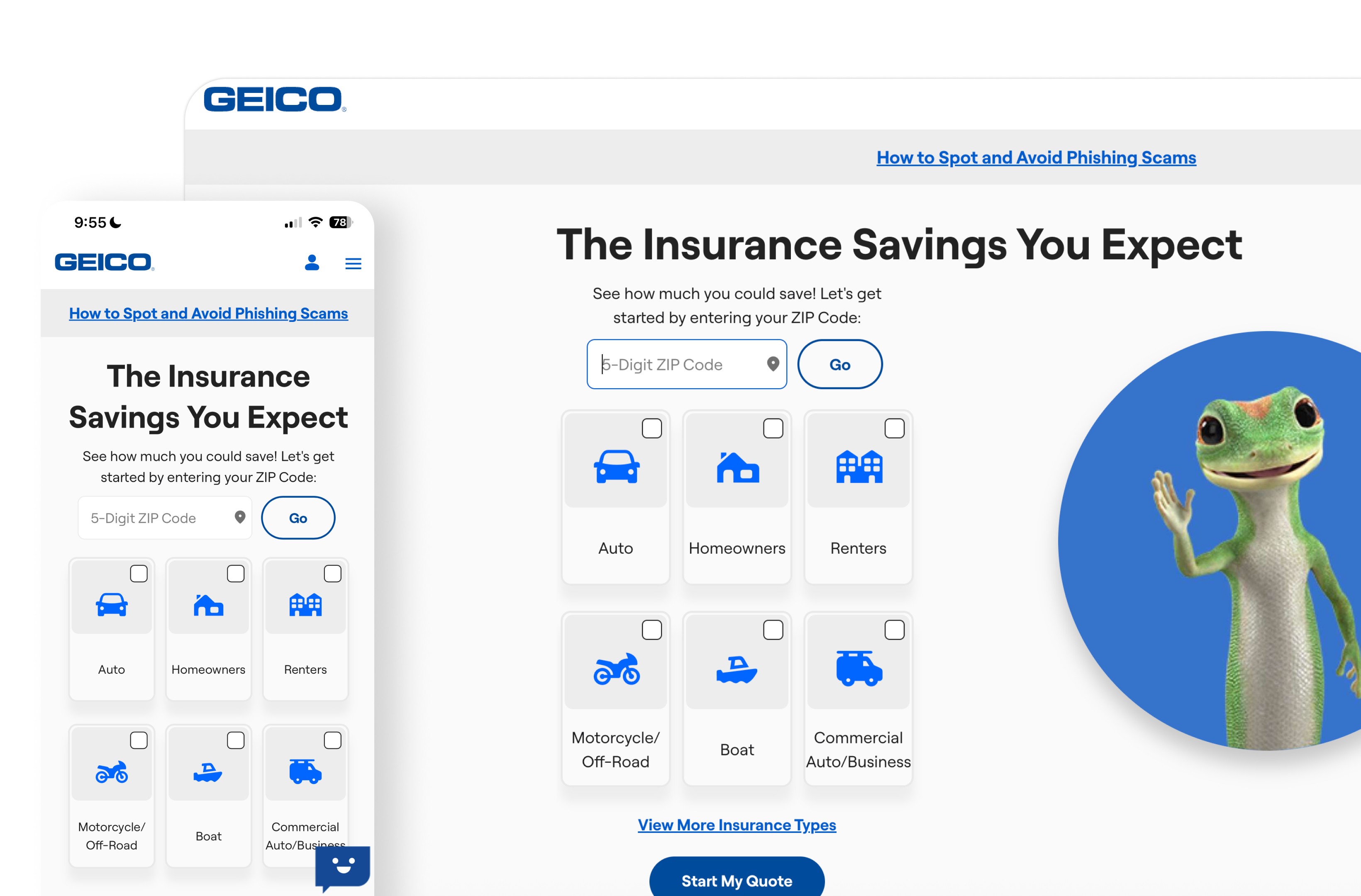
- Reduce time-to-quote by eliminating friction and simplifying navigation.
- Unify content to remove duplication and confusion.
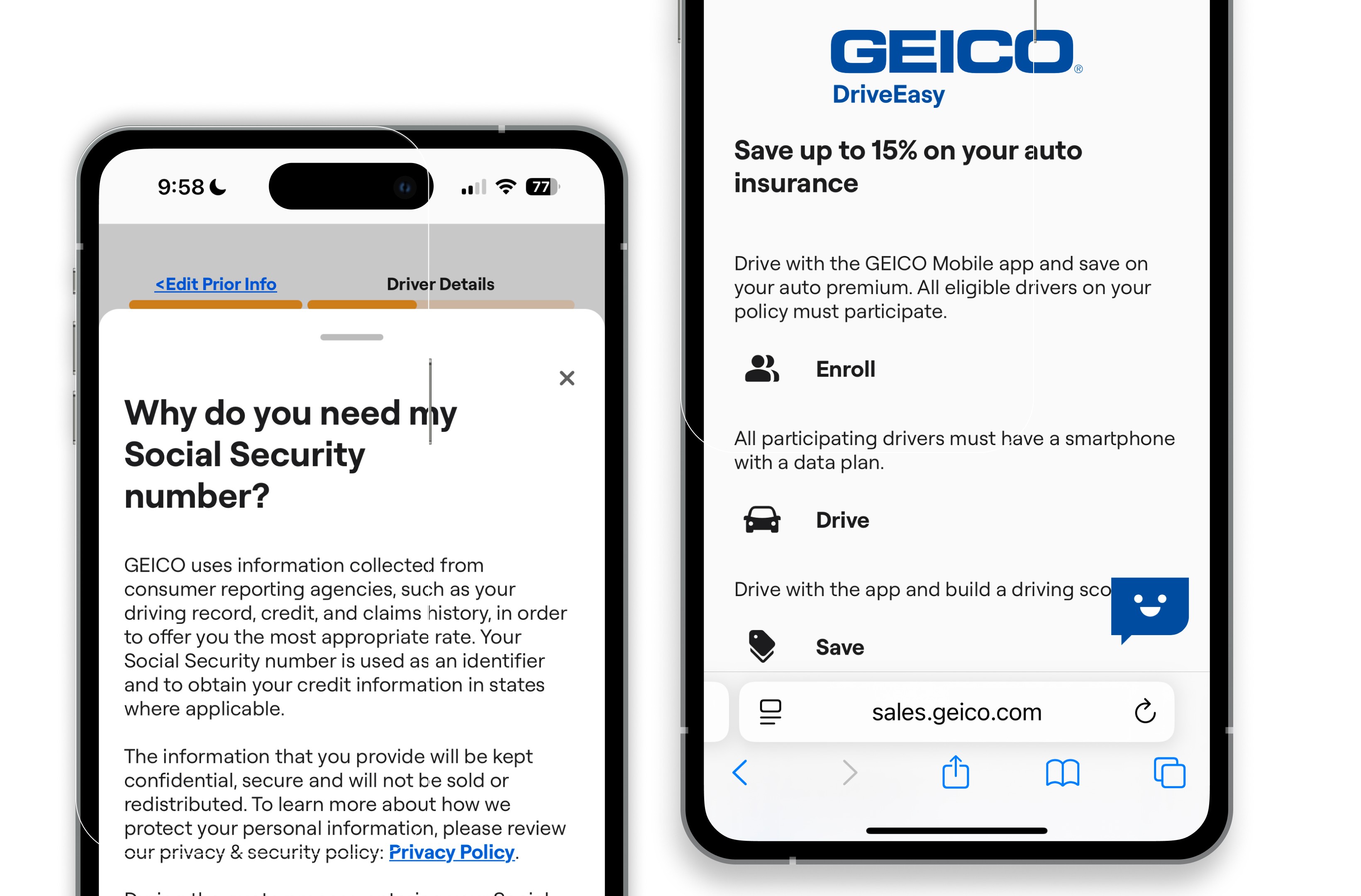
- Enhance transparency in how and why data is collected.
- Design for scale — flexibility for multiple drivers and vehicles.
- Elevate customer trust and make quote outcomes easier to understand.
My roleas Senior UX Designer.
I led the project end-to-end — design strategy, decision flows, and stakeholder alignment:
- Orchestrated cross-functional collaboration with designers, content strategy, PMs, research, engineering, and legal.
- Contributed new components to the GEICO Design System, scaling reusable components and best practices.
- Translated qualitative insights into strategic design action.
- Defined the interaction patterns, decision flows, and scalability guardrails.
- Championed transparency and ethical UX inside the quote process.
- Mentored other designers through complex IA and prototype decisions.
- Led stakeholder alignment sessions to prioritize high-impact quick wins.
"Our role is to make complex systems feel intuitive, transparent, and human. With this project, we turned a fragmented quote flow into a confident, connected journey — built for both the customer and the business."
Key insightsfrom research.
Research revealed friction at every layer — users were confused by repetition, unclear questions, and hidden details. Simplifying confirmation was a clear win, but it raised concerns about scalability.
- 83% of participants found repeated content “confusing” or “unnecessary.”
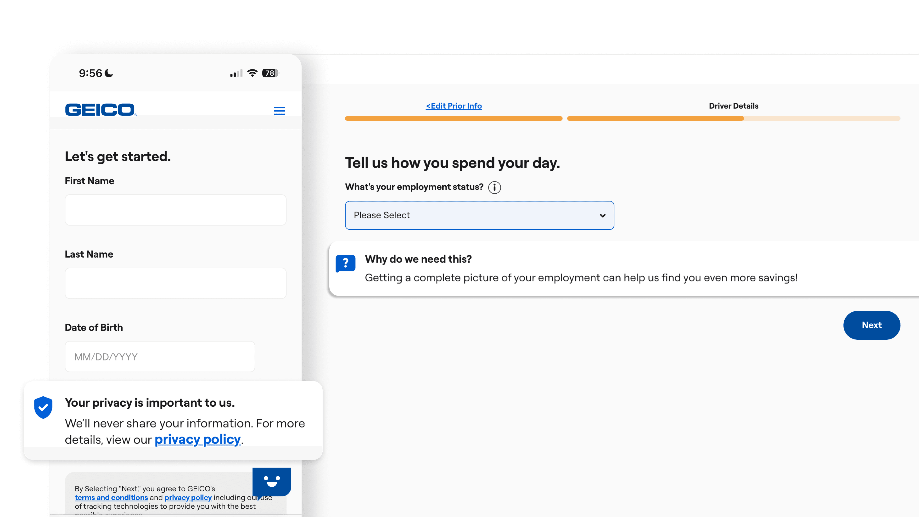
- 71% misunderstood why certain questions were asked (e.g., employment, incidents).
- Quote breakdowns were underused due to poor discoverability.
- Marketing communication opt-out was perceived as “missing” or “hidden.”
- Combining confirmation pages was positively received, but introduced scaling concerns.
What wedelivered.
An optimized sales flow prototype for mobile and desktop — modular, transparent, and built to scale:
- Designed for multi-driver / multi-vehicle scenarios.
- Modular, scalable UI that adapts to 1–N drivers and cars.
- Combined confirmation into a single step with progressive disclosure.
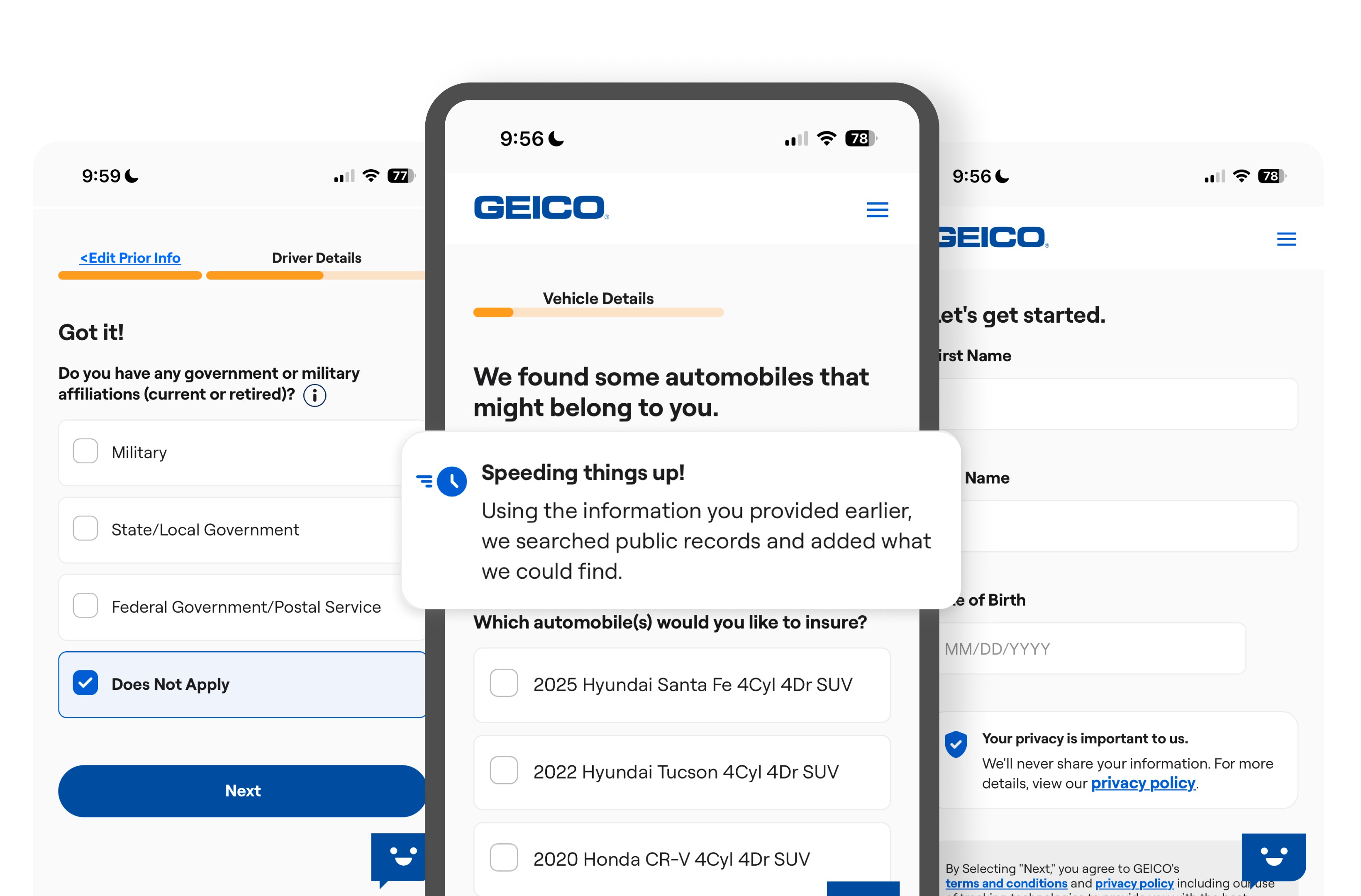
- Embedded transparent explanations for data collection (e.g., DOB, email).
- Introduced new logic for ADAS and incident questions.
- Added quote-breakdown toggles and dynamic legal copy.
- Introduced a marketing communication opt-out with clear explanation.
Futureexploration.
- A/B test different content strategies for employment and incident questions.
- Consider real-time validation during the quote to reduce rework.
- Evaluate personalization logic for scaling quote results.
- Investigate behavioral design patterns to support decision confidence.
Keytakeaways.
Clarity wins trust
Users value knowing why you’re asking something. Transparency isn’t a nice-to-have inside regulated flows — it’s the conversion lever.
Removing steps isn’t always best
Consolidating them smartly is. The goal is fewer decisions per screen, not fewer screens at any cost.
Legal doesn’t have to be boring
With a real UX + Content partnership, it becomes enabling rather than defensive.
Design for scale from the start
It prevents technical and UX debt later — especially for flows that have to handle 1–N drivers, vehicles, and edge cases.
Strategicframing.
This wasn’t a UI polish. It was a strategic experience refactor — designed to:
- Reclaim lost revenue from drop-offs.
- Build long-term trust through transparent interaction.
- Future-proof GEICO’s quote architecture for personalization, compliance, and growth.
- Set the standard for how Design and Product co-orchestrate in regulated industries.